
Home & Stats
Home
Home is the app's start screen: a glanceable digest, never a dashboard you have to work.

- Last N days — two tiles: how many of the last N days you logged, and entries per logged day. N defaults to 30 and is yours to set (2–365) under Settings → Home.
- Movement — up to three trackers whose trend moved most across the window, each with just a direction arrow. No numbers, no red or green: the app shows that something moved, and leaves what it means to you.
- Goals — your goals card, when you have any (see Goals).
- Backup — when you last backed up ("Backed up today", "Never backed up", …); tap to open the export screen.
Which sections show, and in what order, is configurable under Settings → Home. Tapping the digest or Movement opens Stats.
Stats
The Stats tab has three views — List, Charts, Patterns — with a shared filter rail: chips for every tracker, grouped like your Customize list. Hiding a chip declutters all three views for this session; it changes nothing about your data and resets when the app restarts.
List
Every entry, grouped by day, newest first, across all time. Each entry shows only what it actually logged, family by family: ratings, amounts, tags, amount tags, notes. Tap an entry to edit it. Runs of identical one-tap entries fold into one summary row with a sum — expand the chevron to see (and edit) the individual entries.

Charts
Trends over time: Day, Week, Month or Year. Ratings draw as lines on the shared rating scale (gaps stay gaps — a day you didn't log is never counted as zero). Amounts and amount tags draw as bar charts behind the "Show details for:" chips — sums per period, with a "Daily avg" toggle on the longer ranges, and per-tag charts plus a Total for amount tags. Tap the chart to read a point; the detail panel shows that day's or bucket's actual content. Notes appear with their entries, never aggregated.

Patterns
Where the "when" lives:

- Patterns by weekday and by time of day — heat grids showing, for each tracker, when its values run high or low: is sleep worse after weekends, is mood lower in the evenings?
- Show correlation — pick any two trackers (From × To) and see how they move together: scatter plots with a correlation figure for two numeric trackers, bar cards for a rating or amount against a tag, a co-occurrence table for tag against tag. Per-entry or per-period, your choice.
A correlation is a hint for your own reflection, not a verdict — the app computes the figure and stops there.
The PDF report
Data → Export → PDF builds a printable report over the range and trackers you select: an at-a-glance summary, trend charts, most-used tags, weekday and time-of-day heat tables, rating distributions, tag × numeric tables, correlations and tag co-occurrence — each chart with labeled axes and a plain-language "how to read" line that explains the mechanics and never interprets your numbers. Every page footer reads "self-tracked · not a diagnostic record" — it is designed to be handed to a professional as your own observations, nothing more.
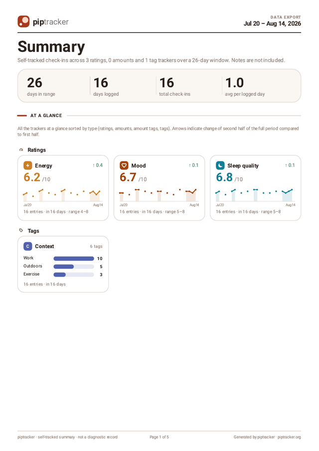
The PDF is a derived document: generating one changes nothing in the app, and it is not a backup (it cannot be imported — see Backup, export & import).